For this project, I was tasked with the rebranding for a non-profit client: The Electronic Reusing Association (ERA). My challenge was to create a new web layout and styleguide for the organization.
- Role:
- Visual / Web Designer
- Time:
- Sept 2020 - Dec 2020
- Project Type:
- School Project
The Client
The Electronic Reusing Association (ERA) is a non-profit organization focused on the reduction of e-waste and providing communities with affordable electronics. They are headquartered in Canada, but have expanded to include locations across the USA.
The ERA’s vision is to rethink e-waste as an opportunity to recover unwanted IT euipment and refurbish donated electronics to prepare them for reuse. The refurbished equipment is then donated to organizations and programs within the community.
Inspiration
After further researching the ERA's brand and history, I created a moodboard to define the key themes for the rebrand. Next, I jumped into defining core components such as Typography, Grid Systems, Logos, and Color Palettes.
Logo
The ERA’s logo was inspired by its commitment to recover, refurbish, and reuse unwanted IT equipment. The combination of letter- and abstract marks for the logo help convey symbolism for the ERA’s three “r’s” (recover, refurbish, reuse). The r’s are symbolized in the three squares of the logo, with each square placed on top of another to signify the impact they represent.
Original logo concepts
Final design

Channels
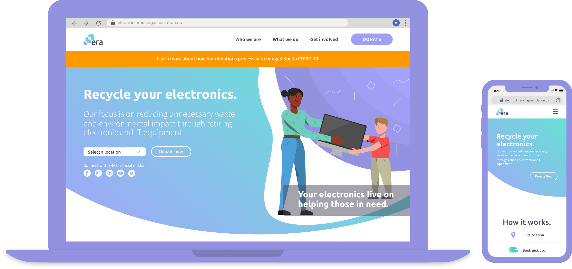
To implement my new branding, I incorporated my visual sysyems into the ERA's website, a mobile responsive website, and a moving van because one of the ERA's primary functions is to pickup and deliver recylced electronics. This channel seemed both appropriate and a way for the ERA to get their brand more visibility.
| Desktop Redesign of ERA's website. |
Mobile Responsive version of redeisgned website. |
Transit Custom decal for donation pick-up vans. |
Imagery
Throughout this project, I was most proud of the imagery I chose for the website. To truly express the journey of the ERA, I felt that illustrations would best describe and convey those points. For this, I designed and created custom illustrations to align directly with the ERA's messaging rather than opting for stock images.


Final Designs
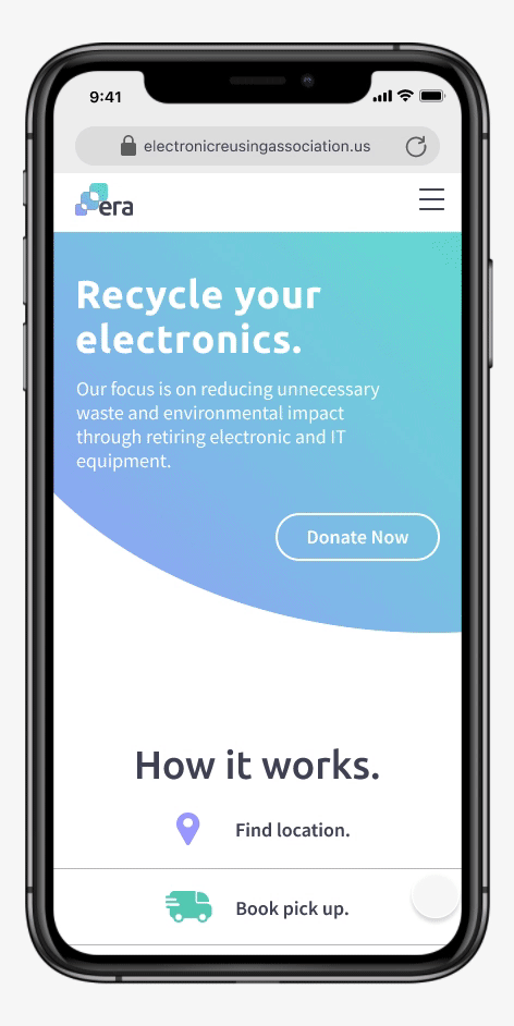
The ERA's mobile responsive website.
Responsiveness included removing and re-positioning images to create separation, but not take up too much scroll space.
The ERA's desktop website.
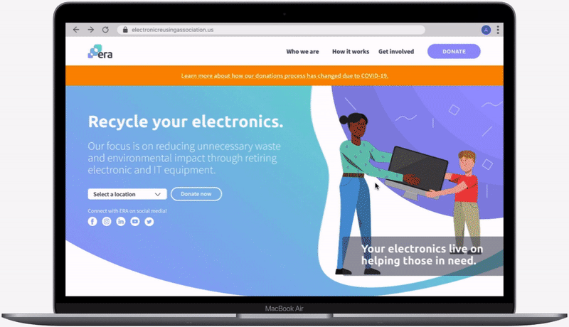
This graphic demonstrates a user going to the landing page and contintuing to the "How it works" page where they learn how to donate their electronics.
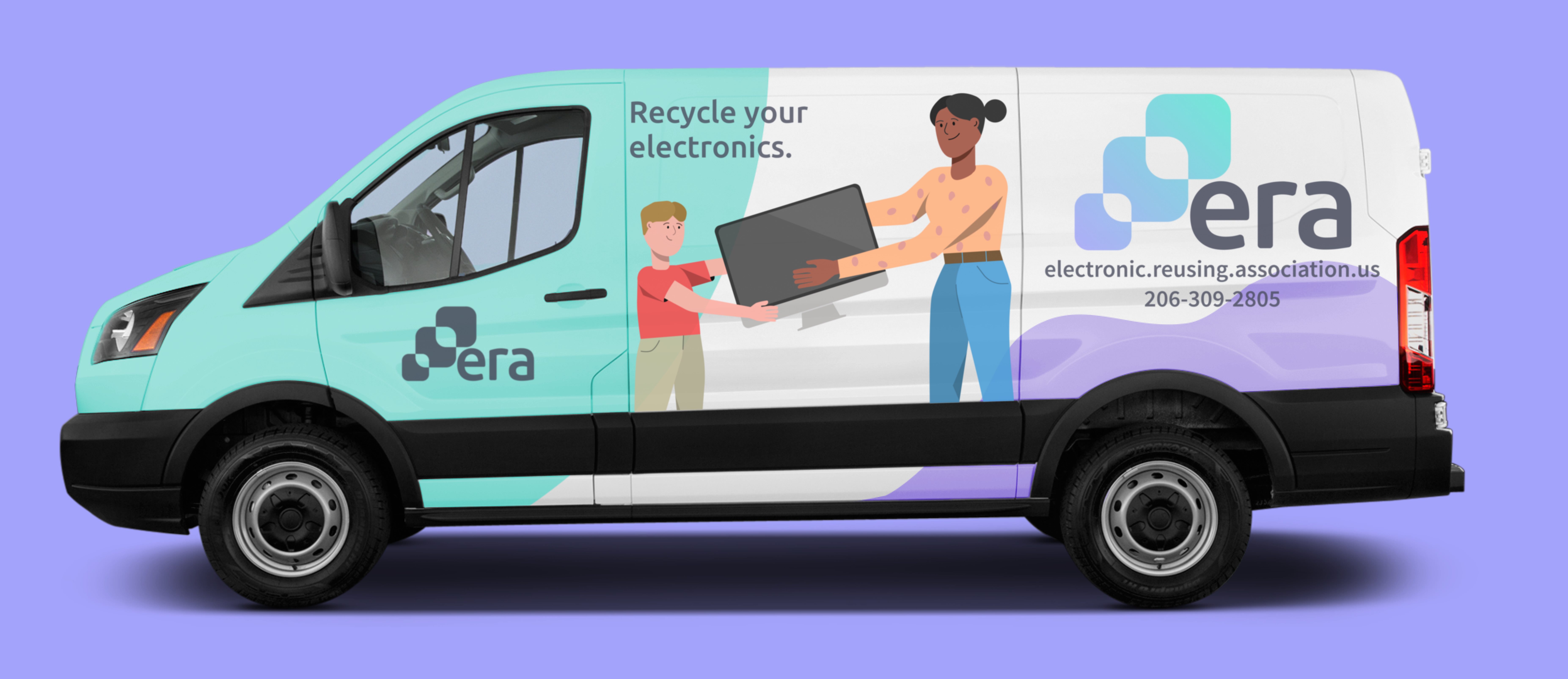
The ERA's donations van.
This is the final van decal concept. I included both the logo and illustrations to capture the theme I was going for.
- Tools: Figma, Illustrator, Photoshop
coded with 💛 by Anders